League of Legends Profile
Boming Zhou
TYKHE GAME PROJECT
League of Legends is one of the most popular games in the world, and is one of the many franchises featured in our Tykhe Game Project.
I thought it was only fitting that there should be a profile for League of Legends in our game.
Tools: Adobe Photoshop
-

Standard Tykhe Profile Design
-

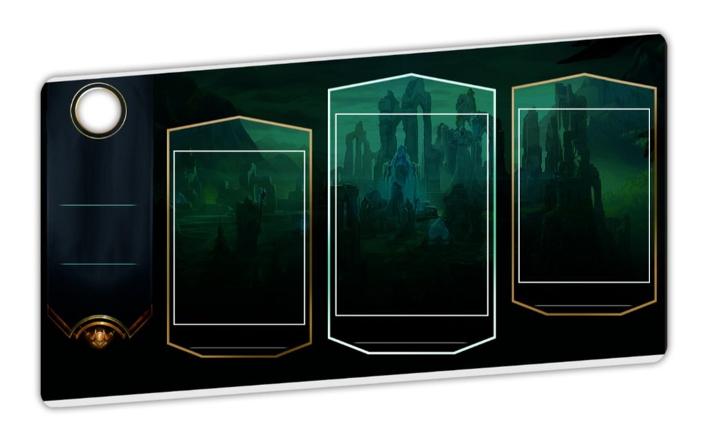
First Draft of League Profile
In my first draft of the profile, I felt like I had a decent foundation but it felt too basic & outdated to me.
For one, the 3 big borders were way too basic, just simply bolder lines with gold or white coloring.
The overall design was quite dark and not really striking enough for me, had a very dim atmosphere to it which made it feel unsatisfying, and didn’t quite capture the League of Legends atmosphere.
On the left side, it is a simple banner flag waving down, which felt neat at first, but became more corny to me the more I looked at it.
So overall, I thought this was a decent start, but the entire thing felt very off to me and I wanted to reconsider the direction I took with this profile design

Taking a closer look.
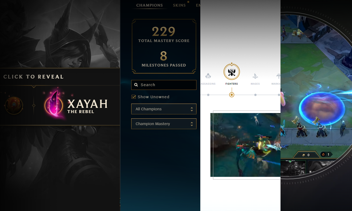
I decided to take a step back and decided to not just look at the in-game User Interface design, but also take a look at the game’s universal branding style; from their websites to marketing material.
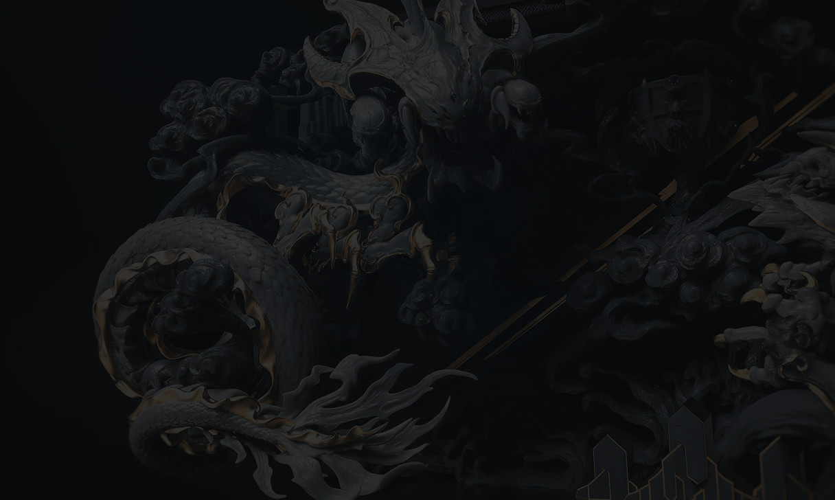
I drew inspiration not just from the game’s UI itself, but also from the websites design and marketing . I noticed there was a common use of thin, golden lines with intricate patterns and compositions. There was a sense of minimalism which elevated the modern feel of the game’s branding, which is exactly what I needed for the profile design
In my first draft, I mentioned that I felt the overall design was outdated and too basic, so using references from the game’s websites and various marketing material, paying closer attention to the colors, lines, patterns, it gave me a much better idea on how to re-approach my profile design.

-

Initial Card Border
In the first card border design for the cards on the left and right of the profile, it was a very simple border design with a simple gold line that had a bit of a sheen on it. Good, but could be better.
-

Final Card Border
I applied what I observed on this border, designing my own border pattern of thin gold lines of varying thickness. This accentuates a premium and designer feel to the border that I was looking for in the profile, while also capturing the League of Legends style.

-

Initial Profile Statistics Section
On the left side of every Tykhe profile is a section where a user’s game statistics are displayed, such as their card count, their favorite categories, etc.
In the initial design of this section, I mentioned earlier that I felt a banner waving down felt a bit too corny and on-the-nose, so it needed some modernizing
-

Final Profile Statistics Section
I simplified the design for the final iteration, by drawing inspiration from League of Legends’ website design with the gold lines floating behind the text.
Each rectangle is a section for the individual statistics to be displayed, so having the statistic text feel separated rather than floating on a banner made more sense and looked sleeker.


