ArtCall
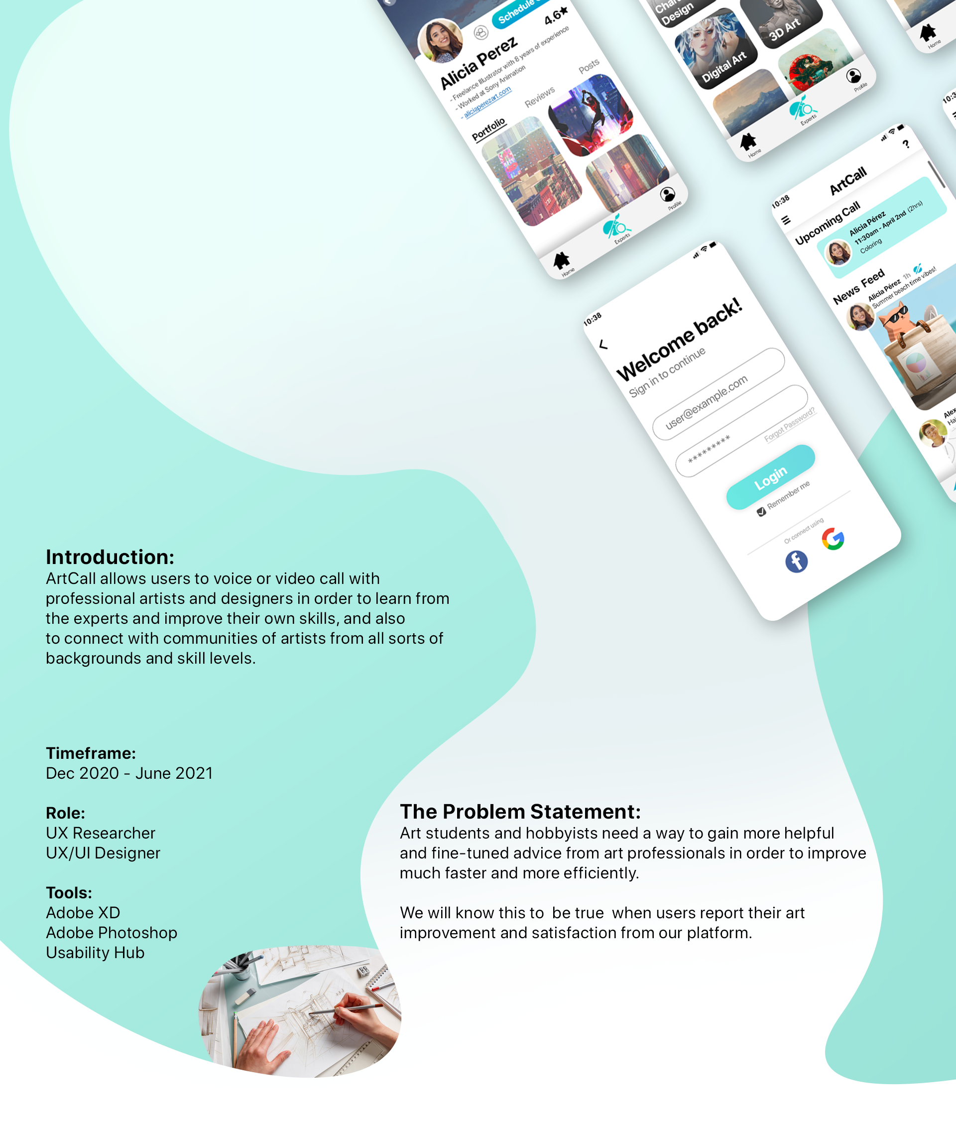
ArtCall is the app I designed for my CareerFoundry UX course project, using the knowledge I’ve gained from class material, user testing, and design collaboration, and applying them to the designs of my app.
From research, personas, wireframing, prototyping, and testing, I became accustomed with the UX design process as I continuously evolved my app’s designs.
This app allows users to voice or video call with professional artists and designers in order to learn from these experts and improve their own skills, while also connecting with communities of artists.
Research
Background:
As someone who is very into Drawing and Design, learning art from various online resources can be wildly inconsistent. These experiences pushed me into designing the app ArtCall, since art education is something I’m familiar with and something I’m passionate about.
Problem Statement:
Art students and hobbyists need a way to gain more helpful and fine-tuned advice from art professionals in order to improve faster and more efficiently.
We will know this to be true when users report their art improvement and satisfaction from our platform.
Competitive Analysis:
I first used two apps that were similar in design with the one I had in mind, Intro: Talk with Experts & 6ya, and did a SWOT analysis to get a good idea of what I can be inspired from for my app, and what to avoid or do better.
User Interviews:
I conducted three user interviews to further understand my target audience and user needs. These participants gave me their insight on their art experience, how they best learn, and educational apps or services. From their responses, I was able to develop an Affinity Map and Personas.
User Personas
A User Persona and Journey Map design put together from the result of my research and interviews.
This Persona and Journey map was a combination of a few interview participants; the ones currently enrolled in college and are interested in art as a hobby.
Since interview participants mentioned community and collaboration motivates them to learn even more, I decided to implement a social media aspect into ArtCall as well. Users can create their own posts, like or share other’s posts, follow each other, or join groups and communities.
User Flow: Bookmarking an Artist
User Flow: Scheduling a Call
These are the two main tasks of the app: Bookmarking an Artist, and Scheduling a call with the Artist.
From the research so far, I wanted to make the process for doing these tasks very simple and convenient. The target demographic for this app is mainly teens and young adults enrolled in high school/college, and based on my interviews, they have busy schedules and need to be organized to balance their life.
Bookmarking an Artist is so important since it takes into consideration how users browsing all these artists would want to save any artist who they find interesting. There are a vast amount of artists available, and being able to bookmark them to call them some other time rather than having to find them all over again saves a lot of time and inconvenience, and allows for better experience.
Scheduling a call is important for both the users, and the artists. It would not make sense for spontaneous calls to happen since artists and users alike have routines and schedules, so having the feature set as scheduling calls makes a lot more sense.
Mid-fidelity wireframes
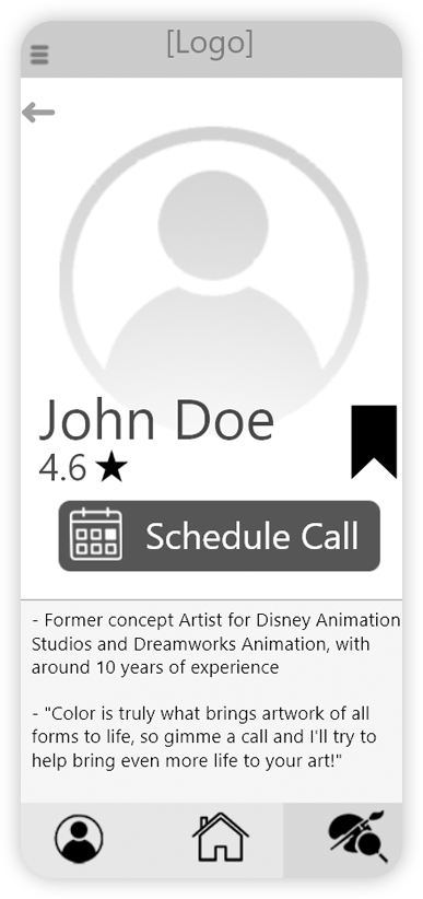
After mapping out the user flows of some of the main tasks for the app, I began designing some low and mid-fidelity wireframes then converted the best sketches into mid-fidelity wireframes using Adobe XD.
These designs were then created into an interactive prototype using Adobe XD. I moved on to test this prototype with 6 participants, in order to gain comments and feedback. I also collaborated with other designers to test my prototype, and they also gave me very insightful feedback.
HOME SCREEN:
Issue: Home screen was awkwardly spaced with strange button placements. The bottom navigation bar was a bit hard to understand, specifically the icon on the right, which was meant to be the “Looking for Experts” page.
Changes: Home screen has been revamped and changed a lot, with a brand new design. Buttons have been adjusted and redesigned in order to fit better on the screen, such as “Create post” is now a floating icon on the bottom right. The taskbar now has labels, for better clarity.
ARTIST PROFILE PAGE:
Issue: The artist’s profile page was lacking a lot of things, such as being able to view their portfolio, see their reviews. Testers liked being able to “bookmark” the artist and see their personal bio, but there was a lot left to be desired in terms of its content and design.
Changes: The profile page now has a much more refined design. Schedule Call still takes center-stage as the main CTA, shown by its coloring, with the artist’s name and picture also drawing the viewer’s attention. The artist’s portfolio, reviews, and posts can all be viewed as well, as these are vital pieces of information for users to get to know an artist beforehand.
After reviewing all the feedback I received and implementing the necessary changes to improve functionality and efficiency, I was able to solidify the app’s overall aesthetics and colors and further polish the design.
Lessons Learned
Some of my biggest takeaways from this project over the course was understanding how much one can learn from the users themselves. Research, Interviewing, and Testing, all taught me a lot about my own designs and how much I can rethink my designs with new perspectives. Even though I've been familiar with the design iteration process, I feel like I was able to learn a lot more here than ever before.
The course has also taught me a lot more about the overarching process in a UX project, and has given me a hands-on approach, which made me learn so much more than if I were just reading about UX without actually practicing it. This includes processes like Agile vs Lean UX, how to conduct interviews and testing, software such as Adobe XD and Figma, and solidifying my design skills in general.
Thank you for reading, and taking a look through my UX portfolio project!


